It’s not every day a renowned design critic reviews industrial design, let alone a subject as specialized as Dangerous Goods floor signs.
But Stewart D. O. North is no ordinary critic.
“Floor signs are the most visible line of defense in promoting workplace safety,” he said. “Some people seek the writing on the wall, some people gaze at the sky in wonder, but everyone looks at the floor.”
North selected several Labelmaster signs as his favorites—and least favorites. Here’s how he ranked them:
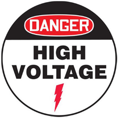
1. Danger High Voltage. “My absolute favorite. The red oval on the black field just seizes your attention, and the ‘High Voltage’ message just jumps off that white background. The lightning bolt is the ideal graphical flourish, understated yet unmistakable.”
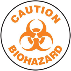
2. Caution BioHazard. “That biohazard symbol might be the most frightening pictogram ever created. Kudos to the sign design team for not cluttering it up. Orange was an unconventional choice that I believe works very well.”
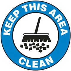
3. Keep This Area Clean. “A fascinating design. The blue ring—somewhere between sky blue and cerulean—is almost unprecedented in workplace safety, and the broom pictogram is simply delightful.”
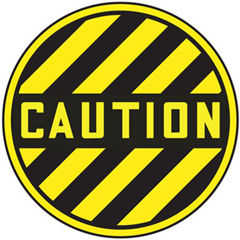
4. Caution. “This is not a sign to be trifled with. Yellow and black, fierce diagonal stripes, and the font is simply terrifying. You can’t say you weren’t warned. Literally.”
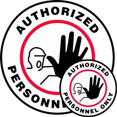
5. Authorized Personnel Only. “To be honest, I think the design and typography are pedestrian. But the pictogram has such attitude! This is a man whose authority cannot be called into question.”
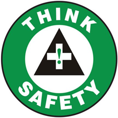
6. Think Safety. “I like the green ring quite a bit, but what is going on in the center? An exclamation point inside a cross inside a triangle? Sorry, my friend, I have no idea what you’re getting at here.”
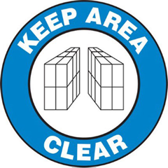
7. Keep Area Clear. “The same lovely blue ring as the Keep Area Clean sign, but the pictogram is enigmatic, almost cryptic. I like a mystery as much as the next person, but here it just muddles the message.”
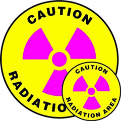
8. Caution Radiation. “Pink? Really?”
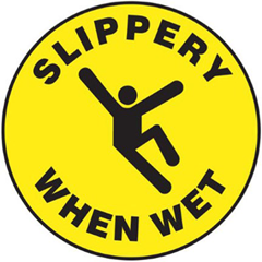
9. Slippery When Wet. “The black-on-yellow scheme is so overdone. And the fellow in the pictogram appears to be clicking his heels in celebration, as if to say, ‘Hurray for workplace accidents!’”
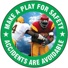
10. Make a Play for Safety. “A football metaphor is supposed to inspire workers to behave more safely? Have they ever met any football players? This accident was 100 percent avoidable.”
North concluded, “Every floor sign is an opportunity to combine image with text, color with shape, form with function, subtlety with impact. I love some combinations more than others, but they’re all vital to protecting people who work with hazardous materials.”
Labelmaster carries signs for every workplace safety situation, and they all come with Labelmaster expertise. Call 800.621.5808 to speak with one of Labelmaster’s experts.
Great post! We rarely think about elements of good design when it comes to workplace signage, even though that’s a key factor in how safety signage is perceived, whether it catches one’s attention and whether the intended message is clearly conveyed.
Kudos for being honest enough to leave in the constructive criticism too.
Hi Carlo, glad you enjoyed our humorous post on floor signs! Thanks for your comment and thanks for reading our blog!