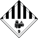
 Some of our friends and customers shared a lively LinkedIn conversation recently about the merits of the new Class 9 lithium battery labels.
Most people thought the labels did an effective job telling carriers and receivers that packages contained lithium batteries. But design critic Stewart D.O. North was less complimentary.
“That cluster of objects looks like my alley on trash day,” he wrote. “If lithium batteries are so dangerous, why does this drab, murky label make me yawn?”
North, of course, is no ordinary critic. He’s also a hazmat aficionado—last year he reviewed our floor sign collection—so we asked him to turn his discerning eye on our hazmat labels and markings. Here’s how he ranked his favorites and least favorites:
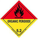
- Organic Peroxide. “En fuego! The Spanish flag colors sizzle like Andalucía in summer, and that giant fireball leaves no doubt what’s at stake here. This label puts the ‘class’ in Class 5.”
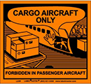
- Cargo Aircraft Only. “Someone at the U.N. has a sense of humor! I find this little cartoon delightful, but I long to see it rendered in full Sunday comics color.”
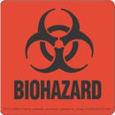
- Biohazard. “I still say the biohazard symbol is the most frightening pictogram ever created. This label could be a movie poster all by itself—rated H for ‘hair-raising.’”
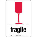
- Fragile. “The word ‘fragile’ may describe a state of mind as well as a type of cargo. I salute the designer for recognizing that a hazmat professional may occasionally need to lighten the mood.”
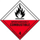
- Spontaneously Combustible. “This label looks like it might burst into flame any moment itself! I’m a fool for this red, black and white color scheme, but I do wish they’d gone with easier-reading white text.”
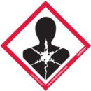
- GHS Health Hazard. “Speaking of red, black and white, I generally like the GHS pictograms. But this one reminds me of the time I ate a gas station burrito en route to Tulsa. Is heartburn a workplace hazard?”
- This End Up. “I give the designers credit for attempting to jazz up a fairly prosaic message, but these earth tones belong in a trendy mall furniture store.”

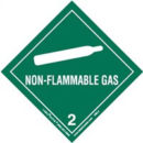
- Non-Flammable Gas. “The calming green communicates neither hazard nor urgency. And I have no idea what they’re trying to communicate with that canoe paddle.”
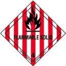
- Flammable Solid. “This label is only suitable for warning that the contents of a package may contain barbershop quartet recordings.”
North concluded, “I like to think of each hazmat label as someone’s attempt to capture the essence of a hazard or warning with nothing more than text, images and color. Some of those combinations work better than others, but they’re all vital to protecting people who work with hazardous materials.”
Labelmaster carries labels for every shipping and workplace situation, and they all come with Labelmaster expertise. Call 800.621.5808 to speak with one of Labelmaster’s experts.
