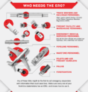
It’s been a while since we heard from design critic Stewart D.O. North, but he recently reached out to share his opinions on our new line of social distancing and hand sanitizing safety signs.
North, of course, is no ordinary critic. He’s also a hazmat aficionado who’s written detailed critiques of hazmat labels and floor signs. He says he was inspired by “… my ongoing gratitude for the frontline workers who have kept our amazing supply chains running during this pandemic. They can’t shelter at home, so I took an interest in what organizations are doing to help keep them safe.”
That interest, as usual, became a style critique. “Social distancing and safety signs are vital to keeping workers healthy,” says North. “But which ones do their jobs the best?”
Here are North’s seven favorites.
- Stop Here / Maintain 6 Feet.
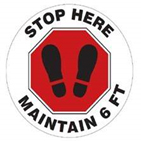
This floor sign incorporates two well-known symbols—the stop sign and the “feet” pictogram—to convey its unmistakable meaning: STOP HERE. It would work just as well with no text at all. Plus, everyone knows I’m a huge fan of the red-and-black color combo. (Full disclosure—Labelmaster did not consult me when they chose their corporate colors.) - Prevent the Spread of Coronavirus.
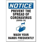
There’s a lot of text on this sign, but it’s masterfully spaced and typeset. The pictogram is ideally sized, and the blue NOTICE banner perfectly balances urgency and restraint. Timely and timeless! - Keep Distance / Maintain 6 Ft.
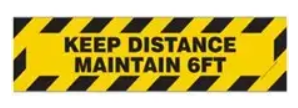
You usually don’t see the black-and-yellow hash marks referring to anything smaller than a forklift, because that pattern is the most extreme way to get people’s attention. Does social distancing merit that level of warning? To this observer, the answer is an unqualified “Yes.” - 6 Ft with Arrows.
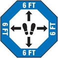
There are two things I love about this floor sign. First, its minimalism—it conveys its meaning with almost no text at all. Second, its sense of fun. The pictogram with arrows reminds me of dance steps, and I can’t be the only one unable to resist doing a small shuffle step on top of this sign. - COVID-19 Help Stop the Spread poster.
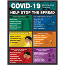
I normally prefer simplicity, but stopping the spread of the coronavirus isn’t a simple topic. This colorful poster clearly explains steps all workers can take, with skillfully selected color blocks to keep readers’ attention. It will never hang in a museum, but compared to most break room posters this one’s a Picasso. - Foot Print Graphic.
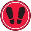
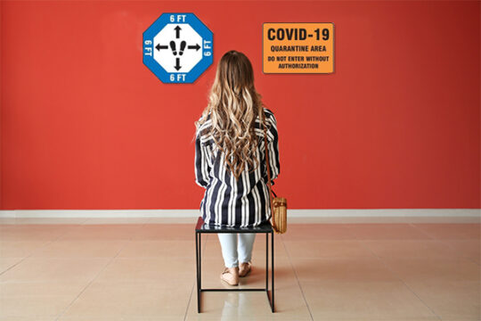
Minimalist? Check. Red-and-black color scheme? Check. Unmistakable pictogram? Check. Plus, the white inner ring gives the whole floor sticker just the right eye-catching focus. Who needs text? - COVID-19 Quarantine Area.
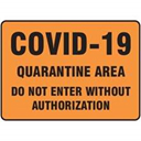
This is not a stunning design, but it is a stunning sign. When your words have this much impact, a little heavy type is all you need. Unlike the other signs on this list, I sincerely hope Labelmaster sells very, very few of this one.
Make sure your shipments are safe and in complete compliance with a full line of solutions from Labelmaster—a full-service provider of goods and services for hazardous materials and Dangerous Goods professionals, shippers, transport operators and EH&S providers.